Wednesday, October 17, 2012

Lab 3: Neogeography

https://www.google.com/maps/ms?msid=217382050623317203461.0004cc47a9cc5b2a2dbb3&msa=0&ll=39.209329,-122.01798&spn=0.007091,0.013937


Interactive Maps 
I chose to make an interactive map of my home-town, Colusa, California.  Located about an hour and a half north of Sacramento.  My reasoning for highlighting the major sources of action in our small town was to prove to myself and others that there are in fact things to do.  Although we are small, our main attractions range from a bowling alley, single-screen theater, boat launch, restaurant on the river, and famous frosties (famous in the county that is),  we are pretty fun.  My map is simple, just like Colusa, but it is fun and free and home to a very supportive community. 

Neogeography can be  described as user-generated graphic content which is in fact exactly what it is.  The benefits of neogeography are vast, mainly in that in tutorials, guides, routes etc. the information is user friendly because it was created by a user, making the information applicable and much more informative that something that may have been computer generated.  Although the fact that neogeography is user-generated is one of it's positives, it can also be seen as a negative, since the information is all relative to the user that created it, and at the time they created it.  For example, if your desired route was designed in a fashion for someone with a car but you wanted to walk, it would be hard to use that specific map.  A further example would be if the map you are using that was designed by a user that assumed you knew where basic landmarks were to direct yourself to a starting point, if you could not get to the starting point, you would never be able to utilize the map.  The differing opinions in what is most valuable to know for a specific map is dependent upon the users, therefore, when using neogeography it would probably be a good idea to have at least a vague idea of who created the map you are trying to use in order to get a relative understanding of how best to use the information in the map. 


Sunday, October 14, 2012

Lab 2: Beverly Hills

Lab 2: USGS Topographic Maps

1) Beverly Hills Quadrangle. California-Los Angeles Co. 7.5 minute series (Topographic)

2) Canoga Park. Van Nuys. Burbank. Topanga. Hollywood. Venice. Inglewood.

3) 1966

4) North American Datum of 1927, National Geographic Datum 1929

5) 1:24,000

6) a) 1200m
    b) 1.895miles
    c) 2.64in
    d) 12.5cm

7) 20ft

8) a) 118 26' 18" W. 34 4' 28" N. = 118.438 W.  34.074 N
     b) 118 27' 27" W. 0' 28"N. = 118.458 W.  34.008 N
     c) 118 24' 25" W. 34 4' 46"N.= 118.413 W. 34.0794 N

9) Greystone Mansion: 560ft/170.69m
    Woodlawn Cemetery: 140ft/42.67m
    Crestwood Hills Park: 650 ft/198.12m

10) VTM Zone 11

11) 3763 Easting. 361.5 Northing

12) 1 square kilometer=1,000,000 square meters

13) See chart below


14) +14 degrees

15) North to South

15) See Photo Below


Wednesday, October 3, 2012

LAB 1: Maps of Interest: ITALY

Le Viste Diverse D'Italia The Different Views of Italy National Capitals
This map was found at Ezilon maps website with the URL: http://www.ezilon.com/maps/images/europe/physical-map-of-Italy.gif. This map is a fairly extensive map of Italy regarding that highlights mainly fixed landmarks. The major roadways are exemplified and made clear, as well as the distance between and of specific towns are indicated by a color key. In addition to these physical markers, the map also highlights the national capitals of the country with population indicators with varying shapes in the color red. I found an interest in this map because it is one of the few things about Italy that is very clear. I lived in Bologna for one year and found that although Italians may be unclear and vague about many different aspects of life, they are for the most part spatially aware and very cognoscente of their country. The 'national capitals' indicated on with dry clarity on this map encompass many different types of prideful Italians. I enjoy seeing how complex this small country is in map form. Il Cibo a.k.a. The Food
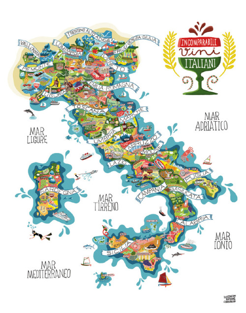
I found this map on another blog found on Tumblr which is of a map created by Antoine Carbineu and is more of a poster map with the title "Carniato Europe Vini"; with the URL: http://themapsap.tumblr.com/post/7071502401/stunningly-detailed-italy-map-by-antoine.http://www.antoinecorbineau.com/Carniato-Europe-new The map is a guideline for the different territories of Italy also known as National Capitals but instead of using freeways and spatial distinction between cities, this map highlights one of the things Italy is best known for...it's food. The regions are accurately placed and proportioned and display the different types of foods, activities, and general persona of the people who live in the different regions. I love this map and think it is so fun as well as an accurate portrayal of what each territory is known for. I lived in Bologna, which is in the Emiglia-Romagna region. Is is home to the first University of Italy (one of the oldest in the world) and to a large viticulture region, which describes the pictures of merlot and vineyards in the region. The huge statue in the main piazza of Bologna, Piazza Maggiore is of the Greek God Neptune, which is why there is a picture of Neptune holding a trident, just as he is in Bologna. This map is a fun map, but also very informative, which is why I enjoy it. I Treni: The Trains
This map was found on the European rail guide website with the URL: http://www.europeanrailguide.com/maps/italy.html. The map shows the major rail routes through Italy and connecting cities. The routes are differentiated by color and are divided into three different categories. The firs being blue for high-speed rail lines. The second being red for fast inner-city rail lines; and lastly the third being yellow for normal rail lines. I find this map to be interesting because in Italy, as in most European countries, public transportation is not only normal, but essential to every day life. The high-speed lines are all run by TrenItalia, which is the most reliable line, although generally the trains work amazingly well. It is fascinating to see so clearly how the main line that can run all through Italy can also take you up to Switzerland.
All of these maps show a different aspect to the country of Italy and give off valuable information.