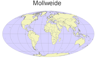
Lab 5 Projections:
I found this lab to be challenging. It was seemingly easy at first to follow the directions, I did not grasp the the overall concept of what was being asked of me until later when I was able to apply the different of types of maps to create the projections. I was under the impression we were projecting some unknown fact or looking to display only a certain kind of data, when in reality we were doing that, just in a simple way-using different map displays to represent the same information, in our case distance.
It was fascinating to see the range in distances that can be displayed by changing map projections. It is also a little scary. Which should we use when measuring fuel for airplanes, for time change, how is one for valuable than the next? I found myself asking all of these questions, but not being able to find answers, only produce more questions by creating different forms of maps.
The general imaging of the world is also fascinating manipulating through different map projections. For example, Alaska looks small and distorted on the sinusoidal map projection, but it looks larger and normal in the Mercator projection. The representations of surfaces in different methods lead to different conclusions. It is useful to have more than one point of view. With many points of view there is also the risk of inconsistency and therefore problems.
Overall map projections are useful. I found the lab interesting, but somewhat difficult, until I figured out how to make the actual map, in mercator first, then it was relatively easy to manipulate and create the other projections. It was also hard to choose between the large variety of map projections that ArcGIS has available.


No comments:
Post a Comment