Friday, November 30, 2012

Final Lab: LA Station Fire 2009


 The Los Angeles station fire of 2009 began with the Morris fire, that overtook 2,168 of Angeles National Forest, and then the Station Fire which burned over 160,000acres, around 252 square miles of National Forest Land burned.  It was devastating and two firefighters actually lost their lives while in their efforts to put an end to the burning of Los Angeles County.  The Angeles National Forest is home to over 72% of Los Angeles County's open space.  The total acreage for Angeles National Foresst is 694,187; meaning that from this Station fire alone, over 23% was burned and directly effected. 

For my different layers I chose to show the major highways, the recreational park areas, which are in orange, and the California park boundaries which are in red.  As you can see from the map the fire area was completely in the Angeles National Forest, which is under the recreational park label.   The map allows us to clearly see how the 23% of National Forest that I mentioned previously.  The fire's destruction has led to many restoration projects of the Angeles National Forest.  Organizations such as Tree People have ongoing projects to restore the vegetation of the Forest and park as well as spreading awareness regarding fire safety.

My reasonings for adding the layers for recreational parks and park boundaries was due to my interest in National Parks and hiking, my addition of the major highways was to incorporate a more in depth depiction of where the fire spread.  It was in fact not far from many major highways, although still in Angeles National Forest.  I also included the California State layer with the avocado green color to provide a contrast between the fire scene and the rest of my layers.

In providing the National Forest Locator map for Angeles National Forest, my goal was to show a clean version of the scene of the Station fire.  The map I created shows where the fire was located and its spreading over a series of five days.  The National Forest Locator map allows us to see the location 'fire free' and also with the surrounding cities and major roads in clear view.  I felt that this map provided a point of reference for the 'fire-less' Angeles National Forest and therefore enhanced the impact of the fire shown within my map by providing the clean pre-fire reference.

In conclusion the results from choosing specific layers to display a certain location and or phenomena show how GIS can manipulate results or enhance findings.  I found this lab to be a nice culmination of all of our learnings this quarter in the maneuverings of GIS.  Learning about GIS as a software, a map generating tool, and as a manipulator of information has given me a greater appreciation for maps, and a more inquisitive mind when reading them.  The Station Forest Fire that occurred in 2009 was devastating to the Angeles National Forest, and GIS accurately and cohesively can display its full effects.


The Angeles National Forest Recreational Area was where the fire was located and overtook more than 23% of the Forest.

WORKS CITED:

. "Angeles National Forest, CA." Recreation.Gov . N.p.. Web. 28 Nov 2012. <http://www.recreation.gov/recAreaDetails.do?contractCode=NRSO&recAreaId=1061&agencyCode=131>.  

 . "Angeles National Forest Restoration." Strategy and timeline for replanting the Angeles National Forest after the 2009 Station Fire. N.p.. Web. 28 Nov 2012. <http://www.treepeople.org/angeles-national-forest-restoration>. 

"California Emergency Managment: Executive Summary ." 2009 LOS ANGELES COUNTY  WILDFIRES AFTER ACTION / CORRECTIVE ACTION REPORT. California Emergency Managment , n.d. Web. 28 Nov 2012. <http://www.google.com/url?sa=t&rct=j&q=&esrc=s&source=web&cd=3&cad=rja&ved=0CDsQFjAC&url=http://www.calema.ca.gov/PlanningandPreparedness/Documents/2-%20Los%20Angeles%20County%20Fires%20Exec%20Summ%203_8_11%20Edits.pdf&ei=XZK2UNCIH8X5igKQrIDYCg&usg=AFQjCNFiarbmFwRbH-Ut_10glN320mfWZA>.

 . "National Forest Locator Map: Angeles National Forest ." United States Forest Service . N.p.. Web. 28 Nov 2012. <http://www.fs.fed.us/locatormap/

 . "United States Department of Agriculture ." Station Fire Recovery . California Emergency Managment , 7 2011. Web. 28 Nov 2012. <http://www.fs.usda.gov/detail/angeles/home/?cid=STELPRDB5292773>. 

Monday, November 26, 2012

Lab 7: Census

 Population Density, 2000.  I created this map using the US census data that was available online. It shows the population density throughout the United States at six different intervals.
 Percent Change  in total population from 1990 to 2000.  I created this map using the data online and importing it in excel form to show the percent change in the total US population within a 10 year span at five different classifying intervals.
Difference in total number of people from 1990 to 2000.  I created this map from the US census data online to show how the population changed over a 10 year span from 1990 to 2000 with the difference of the total number of people shown over five classifying intervals.  


Number of People in 2000.  This map shows the total number of people in the year 2000 over five different classifying intervals to be used as a reference for the other three maps all of which indicate a relationship to the population over a period of 10 years, from 1990 to 2000.


I created each of these maps using the US census data that was available online. From there I created an excel which formed a table for each category as my data and followed the instructions on the lab do create the following maps.  When I was finished I realized that my maps were exactly the same as the ones in the instructions because I had found the exact same data, by the time I realized this I was already done with each of the four maps having created them  using the same data.  I am hoping this is what were supposed to do.  I found this census map series to be the most interesting lab that we have conducted thus far because of its applicable nature.  We could physically take data and import into GIS thus forming the layers of information needed to display certain population values.  It made me have an even higher value for GIS and also realize how easily information can be manipulated. For instance when we changed the classifying values to form a more esthetically appealing map, although the proportions were equivalent, it made the entire map seem different. 

Sunday, November 18, 2012

Lab 6: DEM


                For this lab, figuring out the ways in which to create different DEM maps.  I used the DEM data given on the class website to construct my maps. Within the table titled "Geographic Coordinate Systems information" the extent data (top, left, right, bottom) has all been recorded in decimal degrees. I enjoyed this lab because it expanded upon the role of layers that we had been creating in previous labs.  This time it was clearer what the layers represented and how to create different digital elevation models representing each type of data. 


Sunday, November 11, 2012

Lab 5: Projections


Lab 5 Projections:

I found this lab to be challenging.  It was seemingly easy at first to follow the directions, I did not grasp the the overall concept of what was being asked of me until later when I was able to apply the different of types of maps to create the projections.  I was under the impression we were projecting some unknown fact or looking to display only a certain kind of data, when in reality we were doing that, just in a simple way-using different map displays to represent the same information, in our case distance.  

It was fascinating to see the range in distances that can be displayed by changing map projections.  It is also a little scary.  Which should we use when measuring fuel for airplanes, for time change, how is one for valuable than the next? I found myself asking all of these questions, but not being able to find answers, only produce more questions by creating different forms of maps.  

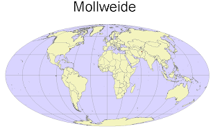
The general imaging of the world is also fascinating manipulating through different map projections.  For example, Alaska looks small and distorted on the sinusoidal map projection, but it looks larger and normal in the Mercator projection. The representations of surfaces in different methods lead to different conclusions.  It is useful to have more than one point of view. With many points of view there is also the risk of inconsistency and therefore problems.  

Overall map projections are useful.  I found the lab interesting, but somewhat difficult, until I figured out how to make the actual map, in mercator first, then it was relatively easy to manipulate and create the other projections.  It was also hard to choose between the large variety of map projections that ArcGIS has available. 

Sunday, November 4, 2012

Lab 4: Introducing ArcMap


       My overall ArcMap experience started out as fun and interesting.  I was excited to be learning about the actual construction of maps and layers.  The initial 10 or so pages of the tutorial were relatively easy and did not pose any problems or concerns.  Quickly after the beginning stages of set-up knowledge of ArcMap the process began to become more and more frustrating, until about the last 10 pages where everything was more or less repeated steps of processes already learned.  However, having finished the assignment, I am very pleased to have it finished and look relatively similar to what it is supposed to, or to the end product that was presented in the tutorial.  That is my brief over view to the ArcMap process; the problem areas I encountered that lead to potential irregularities with the outputs ranged from basic issues such as location certain keys and tools, to losing maps without seemingly having done anything, and just plain not being able to do produce the same map as the tutorial. 

I found the tutorial straight forward and helpful, but making the map is different than reading about someone else making it.  I have only ever used ArcGIS to read pre-existing maps, not to create my own and it is a much harder process.  Embarrassingly enough I had the most trouble locating the specific tools we were needing to use. Once I found them, the tutorial was clear and easy to follow.  I am very thankful to have saved my work after each successful step.  More than once I had to re-open my saved map to repeat the step I had just attempted and failed to complete.

Working with the actual Map it became easier to understand how easily maps can be manipulated to display information.  These maps were relatively unbiased because they were only presenting factual information, however; this map could have been constructed in a way to emphasize the school in the sound zone further, making the case that the airport expansion is not a good idea.  It would also be just as easy to present the sound zone in a way making school seem relatively unaffected by the sound.  It is all in what information you are trying to convey or what you want the person reading the map to think about the particular zones you display.

Overall my first ArcMap experience was very helpful.  I learned a lot from the mechanics of making a map and how much time goes into the presentation of information.  It also became clearer as to how easy it would be to be completely mislead by a map that technically as all true factual information.  Having been thoroughly frustrating trying to finish some parts of this lab, and totally happy with having completed it, I am excited to complete more maps in the future, only with less time trying to find sketch tools and more time manipulating my information perfectly. 

Wednesday, October 17, 2012

Lab 3: Neogeography

https://www.google.com/maps/ms?msid=217382050623317203461.0004cc47a9cc5b2a2dbb3&msa=0&ll=39.209329,-122.01798&spn=0.007091,0.013937


Interactive Maps 
I chose to make an interactive map of my home-town, Colusa, California.  Located about an hour and a half north of Sacramento.  My reasoning for highlighting the major sources of action in our small town was to prove to myself and others that there are in fact things to do.  Although we are small, our main attractions range from a bowling alley, single-screen theater, boat launch, restaurant on the river, and famous frosties (famous in the county that is),  we are pretty fun.  My map is simple, just like Colusa, but it is fun and free and home to a very supportive community. 

Neogeography can be  described as user-generated graphic content which is in fact exactly what it is.  The benefits of neogeography are vast, mainly in that in tutorials, guides, routes etc. the information is user friendly because it was created by a user, making the information applicable and much more informative that something that may have been computer generated.  Although the fact that neogeography is user-generated is one of it's positives, it can also be seen as a negative, since the information is all relative to the user that created it, and at the time they created it.  For example, if your desired route was designed in a fashion for someone with a car but you wanted to walk, it would be hard to use that specific map.  A further example would be if the map you are using that was designed by a user that assumed you knew where basic landmarks were to direct yourself to a starting point, if you could not get to the starting point, you would never be able to utilize the map.  The differing opinions in what is most valuable to know for a specific map is dependent upon the users, therefore, when using neogeography it would probably be a good idea to have at least a vague idea of who created the map you are trying to use in order to get a relative understanding of how best to use the information in the map. 


Sunday, October 14, 2012

Lab 2: Beverly Hills

Lab 2: USGS Topographic Maps

1) Beverly Hills Quadrangle. California-Los Angeles Co. 7.5 minute series (Topographic)

2) Canoga Park. Van Nuys. Burbank. Topanga. Hollywood. Venice. Inglewood.

3) 1966

4) North American Datum of 1927, National Geographic Datum 1929

5) 1:24,000

6) a) 1200m
    b) 1.895miles
    c) 2.64in
    d) 12.5cm

7) 20ft

8) a) 118 26' 18" W. 34 4' 28" N. = 118.438 W.  34.074 N
     b) 118 27' 27" W. 0' 28"N. = 118.458 W.  34.008 N
     c) 118 24' 25" W. 34 4' 46"N.= 118.413 W. 34.0794 N

9) Greystone Mansion: 560ft/170.69m
    Woodlawn Cemetery: 140ft/42.67m
    Crestwood Hills Park: 650 ft/198.12m

10) VTM Zone 11

11) 3763 Easting. 361.5 Northing

12) 1 square kilometer=1,000,000 square meters

13) See chart below


14) +14 degrees

15) North to South

15) See Photo Below